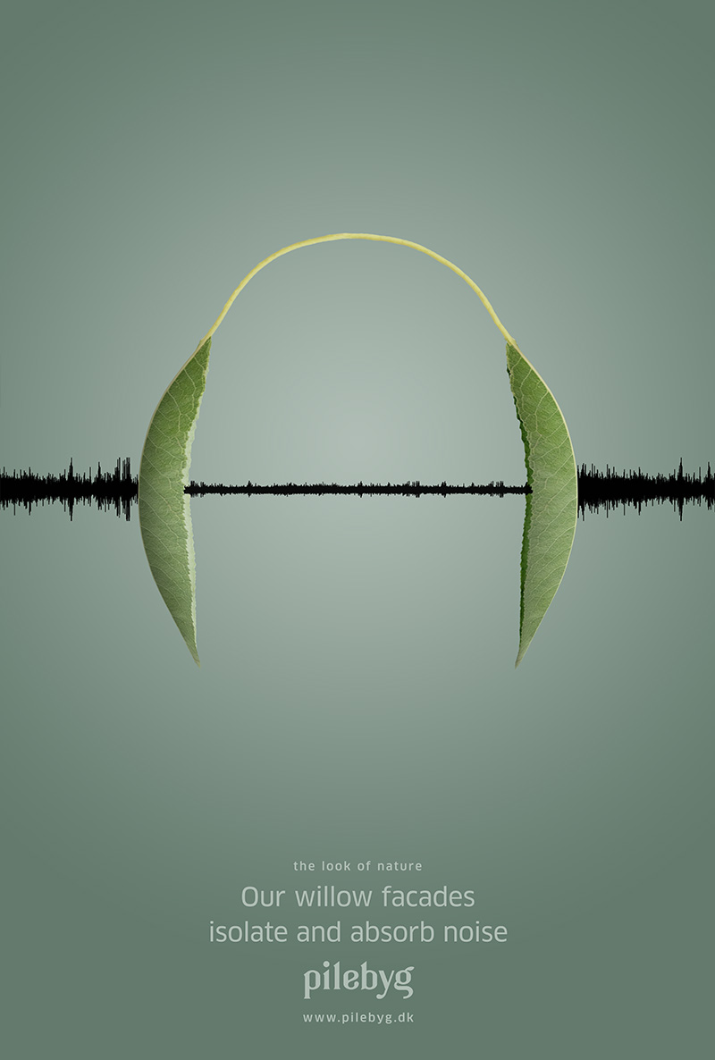
Pilebyg is a Danish supplier of sound barriers and developer of design, facades and Land art made of willow trees in collaboration with architects.
My role
client
Art Director, Photographer
Pilebyg
There were 4 things I wanted to associate in the logotype: the willow bud, bottom tree, leaf and branch.
logo concept
The grid is based on a custom Golden Ratio rules with a few modifications with the letters e and g, that makes the logotype balanced with an organic expression. The custom Golden Ratio is inspired from the shape of a willow leaf.
logo construction
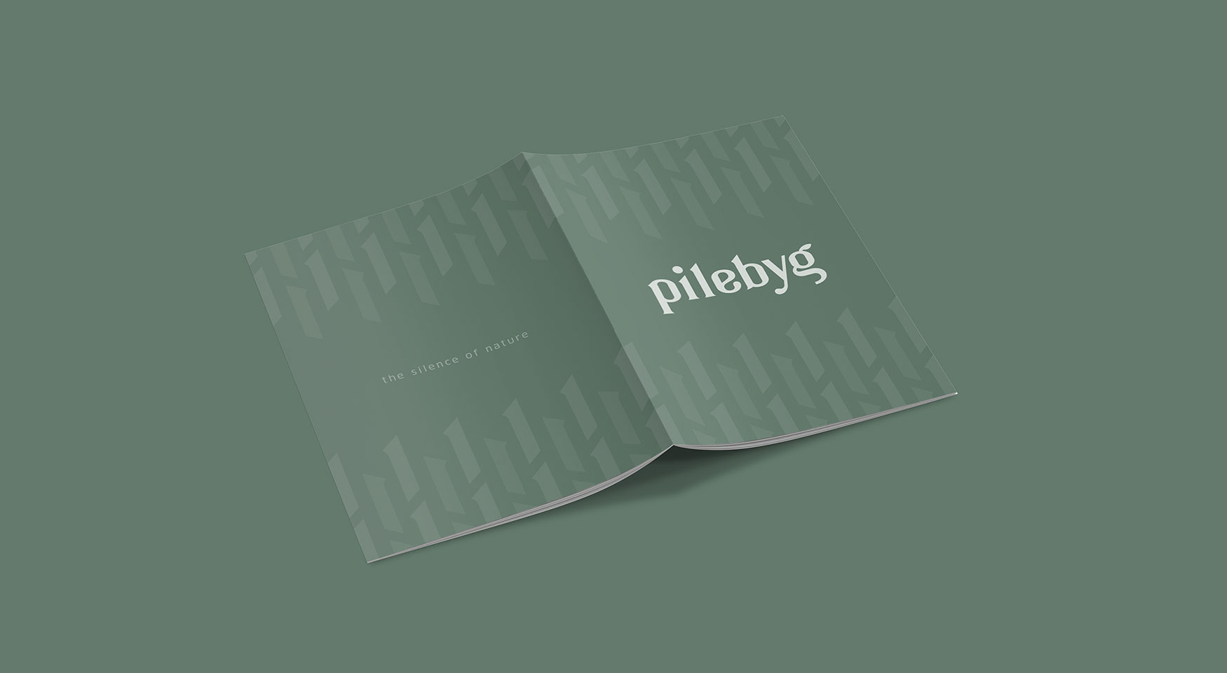
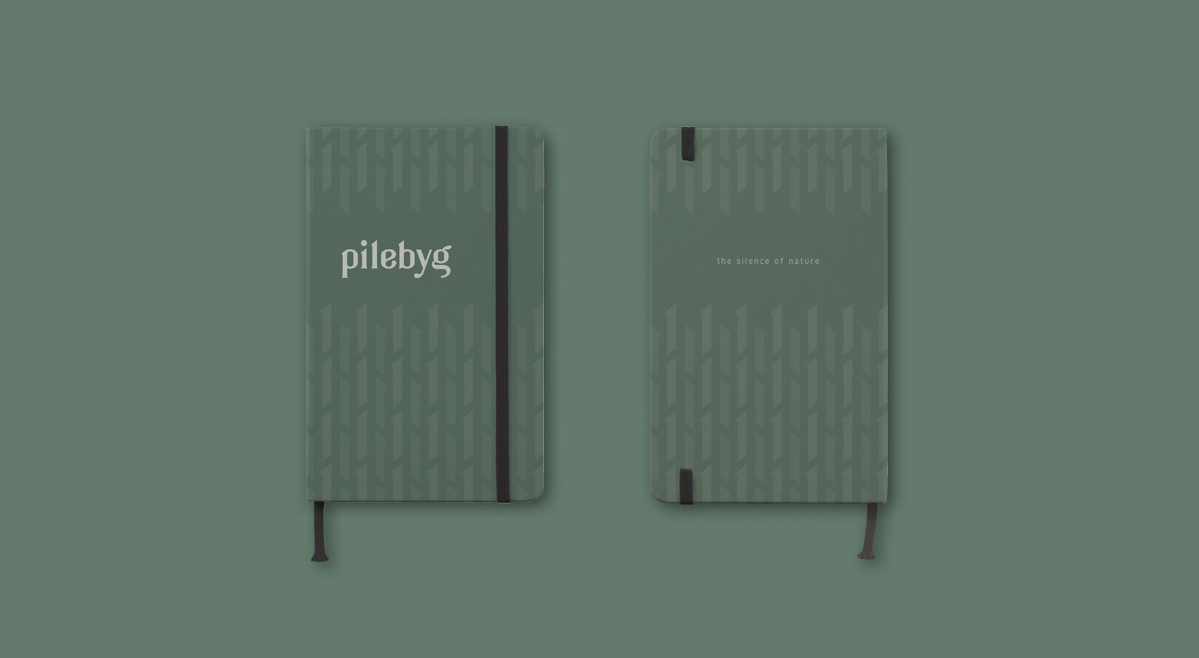
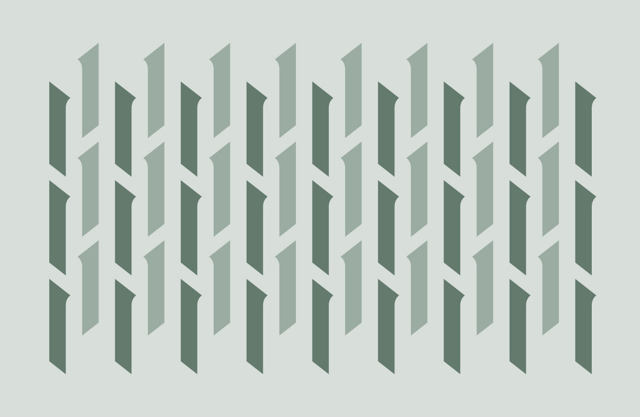
The brand patterns created to support the product’s visuel language from the shape of the logotype by illustrate both willow branch, sound barriers and architecture in perspective.
brand pattern
Brand Identity
Custom Golden Ratio
C: 63 M: 39 Y: 56 K: 14
R: 99 G: 122 B: 109
#637a6d
color
C: 33 M: 18 Y: 28 K: 0
R: 175 G: 189 B: 181
#afbdb5
C: 15 M: 7 Y: 12 K: 0
R: 215 G: 222 B: 218
#d7deda
clan pro font
